Marketers today have more and more to consider when they are developing their online interface with their customers. And one of the most important on the list is a well-thought-out accessibility plan for your website. Your plan needs to allow users who use your communication technologies to successfully gather information and transact business through our website, apps, and other technology platforms.
Whether consumers are using assistive technologies such as a screen reader, a magnifier, voice recognition software, captions for videos, or other assistive tools, the goal should be to make your use of assistive technology a successful and positive experience.
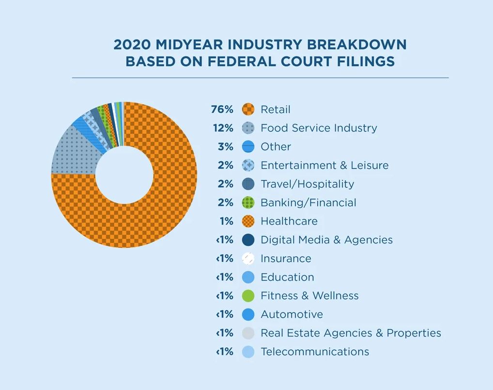
Since many marketers are not aware of the need for assistive technology, they may not even be aware that it is a potential hazard for their business. More than 5,000 lawsuits were filed over the past year against companies over ADA-compliance issues.1 Domino’s was sued by a man with vision loss over failed attempts at using his screen-reading software while trying to order pizza using their popular mobile app, as well as their website. The case went all the way to the Supreme Court who ruled their website and app were not ADA compliant. Fees for non-compliance can range from $75,000 for an initial ADA violation to $150,000 for subsequent violations.2
What does it mean to be ADA compliant? What do I need to do as a brand to make sure my website is compliant? Here are the four principles of accessibility to help set the foundation and get you headed in the right direction.
The legal stuff.
Title III of the American with Disabilities Act (ADA) prohibits discrimination on the basis of disabilities in places of public accommodations, commercial facilities, and private entities that offer certain examination and courses related to education and occupational certification. And to be clear: there are no excuses for violations, even if you’re still “working on it.” To be compliant with the law, you have to make reasonable modifications in policies, practices, and procedures that allow equal access to individuals with disabilities unless it would fundamentally change your business. The ADA law applies to your website, mobile site, mobile apps, emails – anything anyone can access and consume via technology.
The Web Content Accessibility Guidelines (WCAG) 2.0 defines how to make web content more accessible to people with disabilities, including visual, auditory, physical, speech, cognitive, language, learning, and neurological disabilities. There are three levels of compliance: Level A, AA, and AAA—each with its own checklist of items and each gets progressively harder to meet. There are 25 different sets of items to meet to reach Level A compliance; an additional 13 to reach Level AA; and to hit Level AAA, you must complete 23 additional criteria. To be fully compliant with WCAG 2.0, strive for Level AA standards.
Meet the Principles of Accessibility.
According to WCAG 2.0 guidelines, there are four main principles that must be considered in order to make web content accessible to everyone. When you start designing a website, or are updating an existing site, you should evaluate all content to ensure that it is:
- Perceivable – Information and user interface components must be presentable to users in ways they can perceive.
- This means that users must be able to perceive the information being presented (it can’t be invisible to all of their senses).
- Operable – User interface components and navigation must be operable.
- This means that users must be able to operate the interface (the interface cannot require interaction that a user cannot perform).
- Understandable – Information and the operation of user interface must be understandable.
- Robust – Content must be robust enough that it can be interpreted reliably by a wide variety of user agents, including assistive technologies.
- This means that users must be able to access the content as technologies advance (as technologies and user agents evolve, the content should remain accessible).
Don’t forget the alt text.
Modern web design often relies on images to convey important information to users, and alternative text (alt text) allows that same information to be communicated to screen-reader users. Alt text should, at its most basic level, describe the image. It should be succinct and contextual. A good rule of thumb when adding alt text is to imagine that you are conveying the information on a webpage to someone over the phone. How would you describe those images? Making sure that your website has proper alt text will greatly improve its accessibility. If you’re unsure where to start when writing alt text, Moz provides a good synopsis on alt text best practices.
Get descriptive with your links.
Make sure that the copy for your links gives users an idea of where the link is taking them. The links should also make sense when taken out of content from the rest of the copy. Screen readers allow users to compile a list of all the links on a page, so a page with generic links will end up sounding like this:
- Click Here
- Read More
- More Info
Making your links unique and descriptive will allow for screen reader users to quickly navigate through your links. So instead of saying “Click Here for a list of available markets,” try something like “For a list of available markets, visit our Available Territories page.”
Online Accessibility Testing Tools.
It’s a great idea to run your website through an online accessibility checker, but don’t rely on that alone! Automated scan tools generally catch only 20-30% of all accessibility issues, so it’s important that you are manually evaluating, using the WCAG Quick Reference checklist.
Try WordPress “Accessibility Ready” themes.
If you are building your site with WordPress, make sure that the theme you’re using was developed with accessibility in mind. The right theme will do a lot of the heavy lifting in terms of compiling accessible code. Themes with an “Accessibility Ready” tag in the WordPress Theme Directory have been reviewed by the WordPress Theme Review team and verified to meet their accessibility standards. If you’re considering buying a premium theme from a third party, make sure that the developer clearly outlines steps that they’ve taken to follow WCAG 2.0 standards.
Ask the pros. ADA compliance is a critical issue that brands cannot afford to ignore. If you’re looking for help in making your website compliant, our team at Hot Dish would love to help.
Sources: 1Restaurant Business, 2ADA.gov


