In recent weeks, we’ve launched five (count ‘em FIVE) new websites for our partners in the franchise development space. The Hot Dish Effect is driving results for our clients. Long gone are the days of launch and hope for the best. High-performing websites that help generate qualified leads are expected across boardrooms today. Brands want to rest assured that the investment they are making in their website today will produce the ROI to cover that cost in the future.

Data drives improvements.
There’s a lot that has to be examined on the front end, as well as behind the scenes. Any new website build should start with a complete website audit to learn the inner workings of each site, how users interact with content, what pages are visited the most (and why) and what paths drive the highest amount of conversions, along with establishing benchmarks that allow you to compare pre-and post-results. If you don’t know how your site performs today and what areas are impacting conversion, how will you know if the new site is any better?
Design with a mobile-first intention, not as an afterthought.
With mobile site traffic on the rise and important updates from Google, like mobile-first indexing, it is more important than ever to build your design with mobile at the forefront. “For our franchise development partners that have active digital advertising campaigns, we tend to see over 70% of website traffic coming from mobile devices,” according to Natalie Wendel, Director of Digital at Hot Dish Advertising. You risk losing those prospective leads if there are barriers, blocking them from conversion. We’ve all been there, when a chat box or an advertisement takes over your entire screen and you can’t figure out how to escape it, it’s frustrating right? Knowing this, make sure your mobile site creates a positive user experience and avoids those conversion rate pitfalls.
More than just a pretty interface.
Sure, websites need to be visually appealing to hold the user’s attention. But, if you don’t appear in the search results, then it’s just another pretty site. “Through the audit process at Hot Dish Advertising, our team assesses the value of any of the existing pages in order to determine the build for the new site,” says Wendel. “The goal is not to lose any of the SEO equity from the existing site, but also to remove bad traffic or utility pages showing within the search results, which may be hindering organic traffic to your meatier pages.” Each page has a purpose to guide the potential prospect through the opportunity and to let the search engines know the content that is relevant to the site visitor.
Now, let’s take a look at a few of the websites we brought to life that are exceeding our clients’ goals and our own high Franfocused™ standards.
Client: Express Employment Professionals
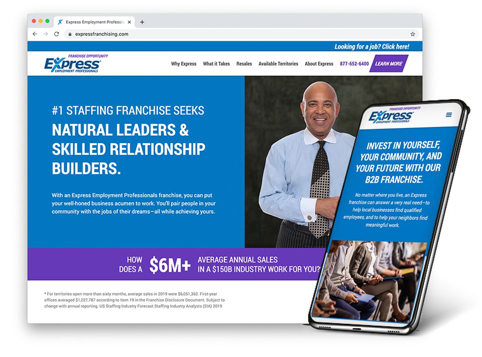
The challenge:
Express Employment Professionals, one of the top staffing companies in North America, needed to refresh their franchise development website. The overall experience for users was clunky and didn’t present the franchise opportunity in a clear and concise manner. In addition, the brand was seeing a high volume of job applicants submitting their information. It had been a number of years since the site was built, so the technology behind the site was also outdated.
The solution:
When developing the new site, we not only freshened up the creative look and feel with a conceptual theme, we also added animation to highlight key distinctions—all while creating a seamless user experience for optimum viewing on all devices. Although we saw a decrease in conversion rate as compared to the previous site, we have effectively reduced the amount of job seekers completing the franchise form to drive a higher volume of qualified leads. Conversion rate for the site is 3.14%, which is above the industry average of 3%.
See site: expressfranchising.com
Client: Pinch A Penny Pool, Patio & Spa
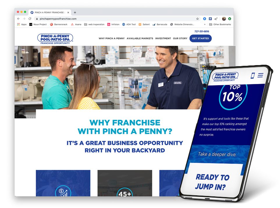
The challenge:
The pool experts at Pinch A Penny Pool, Patio & Spa, the nation’s largest swimming pool retail, service and repair franchise, were looking for a new website to aid in their franchise development efforts. The old website was copy heavy and utilized outdated technology that made for a poor user experience—especially for mobile users who had to scroll through large blocks of text.
The solution:
We took a deep dive to create a refreshing new experience. The end result was a Franfocused™, responsive digital experience that elevated Franchise Owner testimonials through videos and brought key selling points and statistics to life through animation.
See site: pinchapennypoolfranchise.com
Client: Pizza Ranch
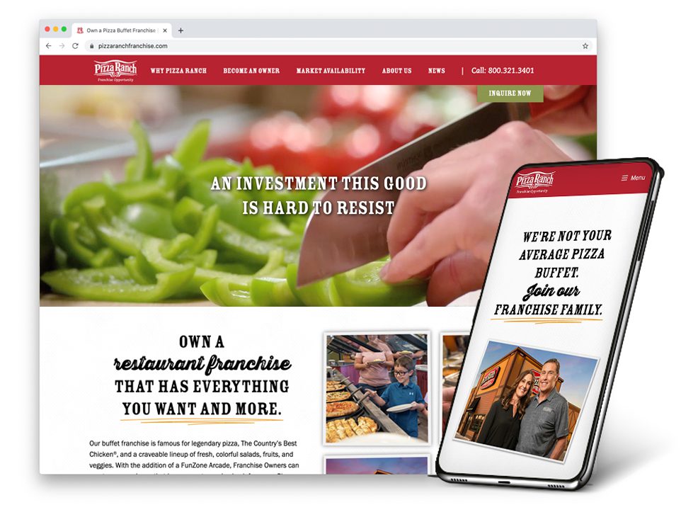
The challenge:
While the previous site was visually impactful, it had too many pages and multiple ways to navigate the site. The data showed that users didn’t know where to go to find what they were looking for, which was causing the conversion rate to fall below the industry average.
The solution:
Our recipe for success? We peeled back the layers to simplify the page content and reduce the overall number of pages on the site, while also reorganizing the information into bite-size pieces to deliver clarity and embrace the scroll.
See site: pizzaranchfranchise.com
Client: Taco John's
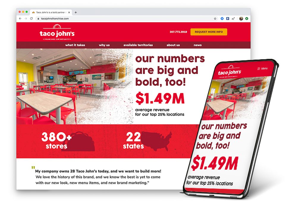
The challenge:
The Taco John’s franchise website was very copy heavy as a way to achieve better search engine organic ranking results. Our audit showed that the user experience was poor. The site was over-indexing for the wrong keywords and ultimately attracting an abundance of users who were not necessarily the target audience. This caused the overall conversion rate on the site to drop.
The solution:
The new website is bigger, bolder and better. We updated the creative look for more visual appeal while highlighting powerful statistics through animation. All copy was rewritten in the brand voice to tell a more engaging story while incorporating SEO best practices. The first week after the site launched, we saw a 43% increase in conversion rate compared to the previous period.
See site: tacojohnsfranchise.com
Client: Tropical Smoothie Cafe
The challenge:
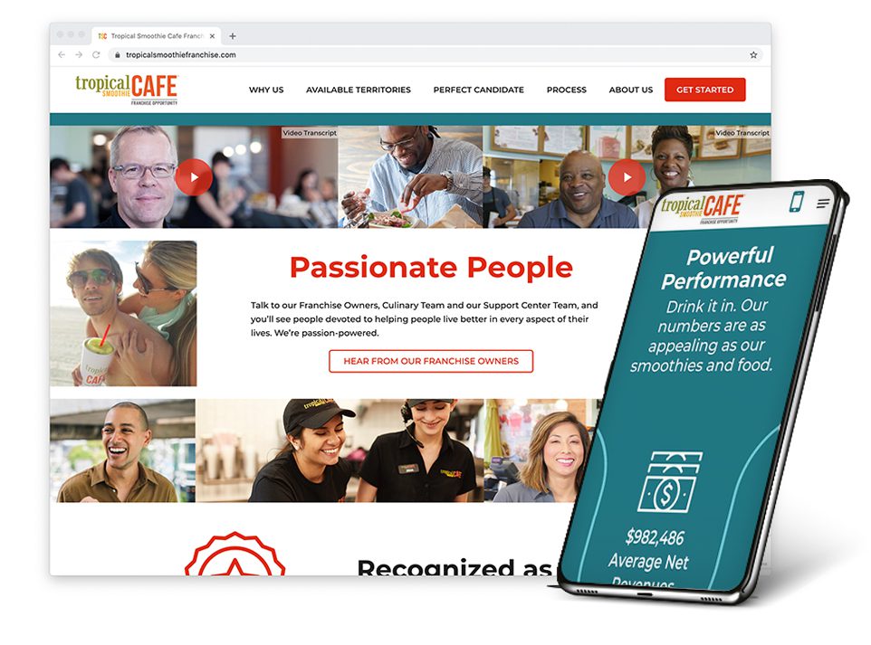
The previous Tropical Smoothie Cafe franchise site had been active for quite some time and was outdated in terms of branding and technology. It was time for a refresh!
The solution:
We dialed up the freshness and flavorful energy of this better-for-you franchise to better align with the new brand creative, messaging and copy tone. Videos, animation and franchise testimonials now spotlight key content to drive impact. New technology enabled the site to be responsive and deliver a more mobile-friendly experience. After launching the new site, we saw a 14% increase in the percentage of financially qualified leads as compared to the previous month, indicating that the new site does a better job of driving qualified leads.
See site: tropicalsmoothiefranchise.com
Looking for website development that drives results and elevates your brand’s personality and distinction? Let’s talk.


