As a full-service agency, our days at Hot Dish are never the same. Whether we are designing billboards, writing radio scripts, scouring Google Analytics, or taking a break around the office keg, we stay busy working hard for our clients. 2016 was no different.
One common theme last year was building websites. With a slew of consumer brand and franchise development websites completed, we thought we’d share our top three tips to consider when building a franchise website.
A Site Architecture in Time Saves Nine
As fun as it can be to dive right into designing and see a new look and feel, it’s crucial to put work into the website’s framework. We study your Google Analytics to see where referral traffic is coming from, see where people are spending their time, perform keyword searches of what information people are hoping to find, etc. Using this data helps to ensure your website will house the answers to the questions your customers/prospects are asking. We use all this data to map out where information and sections will appear on each page to improve the functionality of the website. This saves times in the long run and allows the design process to be the icing on the strategically laid out cake.
Where in the World are there Franchises Available?
Prospective franchise owners want to know what markets you have available. A well-designed territories page helps prospects self-select in or out of the brand, making it an essential piece of their decision-making process. And it’s an added bonus if it is interactive. Below is an example of a page we develop. Interact live with it here.
If at First You Don’t Succeed, A/B Test Again.
After the months of work that go into developing and programming a website, it’s easy to want to kick back and enjoy a job well done. Post-launch is when the real magic happens. Optimizations, testing, monitoring analytics, and user interaction are essential. Some of the best practice tests that we’ve utilized to help our clients convert most effectively are call-to-action buttons, color changes, rearranging content, incorporating video, and changing up photography. The sky is the limit.
These tips just skim the surface of things that go into developing a sound website that works hard for your brand. With many under our hat, we know what makes a site run well, tests to try, and industry stats to benchmark your results against.
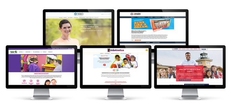
Here’s a sampling of the sites we created for clients in 2016:


